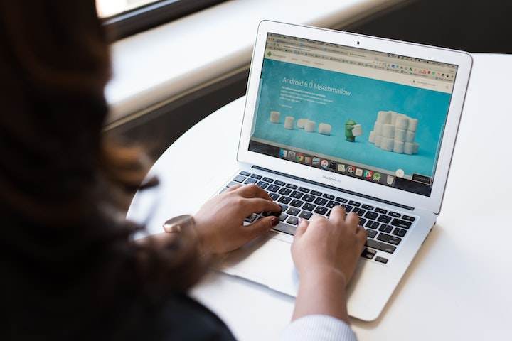
How a website can help you grow your business
Presently, there are unlimited choices when it comes to selecting a web designer, and most of the time, small businesses with a low budget will go for a template or a DIY website. However, professional websites are almost always better than DIY websites.
Getting professional websites will cost you more money but bring in rewards that are not available for those DIY websites. Not only do professional websites feel and look customized for your company, but they also come with the unit of knowledgeable people you need to keep it running smoothly, serviced, and updated. In addition, your company is at all times accessible! Here are some ways professional websites will help you to grow your business:
In today’s world, a virtual presence is significant for your small company because your site gives your clients access to your services and business 24/7 and from any place in the globe.
Professional websites build reliability while being active communication and marketing tools for your users. Not only does your virtual presence help your users find you, but if used in association with active social media venues, your site helps target your audience and establishes an even broader network.
Establishes trust and credibility
Professional websites will provide detailed information about your company and let potential clients know your business is constant. You can present a clear idea of your company and its vision. The About page of your company will provide a bit of information that targets your users.
You will know exactly who your audience is when you tell them what they want to hear. The qualities you detail your small companies to build confidence and confidence build an audience. You can provide your website to be about your companies and feed your expected audience.
Your contact page is a quick and easy way for customers to reach you or inquire about information, or when you respond with a swift turnaround, you can kindle a relationship with that user.
Increases traffic and targets your audience
Blogging is good for producing traffic and great for providing support to your SEO. Good content is looked for when your blog content is suitable, and Google algorithms for your target audience increase your opportunities for discovery.
A trained designer can customize your site with your targeted user in mind. Although there are loopholes for every service, industry, market, and service, the best website developer might look at the particular details with modern tools like Google Analytics and can enhance your communications by optimizing the specific areas of your site that are distinct to your viewers.
When you are looking for a professional website designer to create a website for your company, make sure they offer you a comprehensive collection of services that can meet and beat your transaction needs. In addition, a professional designer has to answer all of your queries and concerns about the growth and composition of your new website that will help your company grow and be competitive in your market.
Crucial Web Design Tips for a Professional Site
A website will not succeed primarily through thought-provoking content or compelling design. Instead, it has to have a style that supports your website’s functionality and user experience while being simple to figure out at first glance.
They say, “Beauty is in the eye of the mouse-holder.” Different people prefer distinctive styles. However, that does not imply that there are not a few ground rules you can follow when selecting the presentation of your website.
Following are five tips to make sure that you are heading in the right direction and are not turning your customers away:
1. Minimalist homepage and free of clutter
We do not always read each word on a site. Instead, we quickly scan pages, picking out sentences and keywords. So the less a user looks at your website, they click on or remember or read, the better they will evaluate and process what is happening in front of them.
It makes it more reasonable for them to do what you require them to do. Make sure to break Text and Calls To Action up with legible paragraphs and larger subheadings.
2. Design with visual hierarchy in mind
As the technology to display information evolves with smartphones and computer screens, the designer’s work remains to organize the content. Then, you have seconds to tell them what your site is about and grab someone’s attention.
If you build an apparent authority to your data, readers cannot help but automatically follow the breadcrumbs you left for them. After that, apply spacing, size, color, and contrast for additional accentuation, waiting consciously for what is drawing attention to your webpage and ensuring that it is always intended.
One of the design details we have found for creating a great visual hierarchy is strips: These will help build your website into pure, absorbable sections of content.
3. Create easy-to-read website content
“Readability” estimates how simple it is for users to recognize sentences, phrases, or words. When the readability of your website is high, viewers can efficiently scan your website and take in the data in the text without extreme effort. It is easy to achieve the readability of a website with these rules:
a. Contrast is key
It is necessary to have adequate contrast between the background and your text, to be precise. You most likely have already thoughtfully selected colors that are parts of your brand’s identity and should be portrayed on your site. Do not sacrifice readability for creativity; feel free to play with colors.
b• You cannot read what you cannot see
Previously, websites had smaller fonts; however, over time, people understood that 12pt fonts are difficult to read online. In addition, when a screen is 24 inches from the user’s face, most people will struggle to see tiny fonts. Therefore, a standard rule of thumb you will see on the website is to keep your body text at least 16pt. That is a decent place to start, but be sure that this number entirely depends on which font you are using.
c• Serif vs. Sans Serif
Serifs are little projecting lines or points that a few fonts have on the ends of their letters. Times New Roman is from the Serif fonts. Sans Serif means without serif. The fonts are typically an excellent choice for online texts like the one you are currently reading.
d• Don’t use too many fonts
Do not use more than three different typefaces throughout a single website. Of course, some projects may call for more elaborate font combinations, but the overall effect should be harmonious and not cluttered if you use various fonts.
4. Make sure your website is easy to navigate
Website navigation is not the place to be innovative; it may be your design to break the work. Do not send visitors on a wild goose hunt when roaming through your website. A website with regular navigation will help search engines guide your content when improving the users’ experience.
5. Stay mobile friendly
We live in a cell phone culture, making it easy to ask: What do my users see when they reach my website? Wix will automatically create a mobile-friendly version of your website to keep pace with the various mobile world. So be sure to put yourself in the user’s shoes and test each web page, button, and user action.